Tuesday, September 29, 2015

Colour Prevails Trio

When the Colour Prevails display went up at my Walgreens back in April or May, I bought a few of the polishes to try but as often happens, got distracted by other things and didn't actually try them for months and months. Fortunately, these are core colors so still in stores.

I started with a pale yellow green creme called Socially Awkward. This was three coats, and I found the winged handle didn't help me at all, possibly because I am really comfortable working with more conventionally shaped handles. (The wing does pull off if you don't care to use it.)


I stamped on top of Socially Awkward with the shimmer I selected to try, Blue Blood, and added clear topcoat. (If I'm interpreting my notes correctly, the design is from Born Pretty plate 65.)


Then it was Blue Blood's turn in the spotlight. I was a one-coater; I added a line of square stones and sealed the look with clear topcoat.


I topped Blue Blood with one coat of glittery Mr. Wrong, plus clear topcoat. On my thumb, I did three coats of Mr. Wrong plus topcoat, and it was still somewhat sheer.


These are fine polishes, but the handle is odd, and they're pricey: $8 for .34 oz.


Friday, September 25, 2015

HPB Presents Autumn

Sample provided for review

Part of getting back into my blogging routine is keeping up with the Hobby Polish Bloggers group on Facebook. This month's theme for the HPB blog linkup is fall/autumn, fittingly enough for this hemisphere. To do my look, I chose two colors from Zoya Fall 2015, the red creme Janel from the Focus collection and the brown shimmer Cinnamon from Flair. I did two coats over Qtica Nail Growth Stimulator and finished with Diamond Dry topcoat. I used rub-on decals from the scrapbook section of the crafts store to further decorate my nails. The particular decals I used have been sitting in my basement for several years, which was apparently too long, as a few of the designs didn't want to cooperate when I wanted to take them off the backing sheet, so I couldn't use those, but enough were fine that I mostly was able to make the vision in my head come to life on my nails. (For more on the rub-ons, see this post from the first time I used them.)


The two nails I broke two weeks ago are growing back nicely; they're almost long enough to blend in again (I couldn't bear to cut down all my nails to match, so I've been sporting two shorties all this time.)

My right hand has one anomoly, a purple butterly that doesn't really fit the autumn theme, but it practically peeled itself off the rub-on sheet to get on my nails, so I included it.


I'm going to take a tour and see what the other bloggers did for the theme; if you'd like to join me follow the links below. Happy Fall!

The polishes shown in this entry were provided free for review purposes. The content of the entry was not dictated by the provider, and I get to keep the polishes for my own use.


Thursday, September 24, 2015

Essie Silk Watercolor Layering Experiments

Continuing along the Essie vein from Tuesday, today I have some playing I did with the Essie Silk Watercolor collection (which of course were also included in the jelly polish comparisons post). Left to right: Love Sheen, Blush Stroke, Art New-beau, Muse Myself, White Page, Highest Bidder, No Shrinking Violet, Point of Blue, Pen & Inky.


To start, I did a handful of the warm colors, laying two coats of them down over two coats of White Page as a base. Top to bottom: Muse Myself, Art New-beau, Blush Stroke, Love Sheen.


Then the real fun: layering. I was just interested in seeing how these combined, so I just did a very rough gradient. Starting at left: Muse Myself plus Art New-beau and Blush Stroke, Art New-beau plus Blush Stroke and Love Sheen, Blush Stroke plus Love Sheen and Muse Myself, Love Sheen plus Muse Myself and Art New-beau. I added topcoat to even out the layers a bit.


Then the cool hues (well, cool-er in one case), again two coats over two coats of White Page: Highest Bidder, No Shrinking Violet, Point of Blue, Pen & Inky.


Rough gradients here, starting at left: Highest Bidder plus No Shrinking Violet and Point of Blue, No Shrinking Violet plus Point of Blue and Pen & Inky, Point of Blue plus Pen & Inky and Highest Bidder, Pen & Inky plus Highest Bidder and No Shrinking Violet.


In general, these layer with each other pretty nicely, with the exception of the two pinks being too close in color to each other. I'd also like it if the purple were a tad more pigmented. Still, they're a lot of fun to play with.

Tuesday, September 22, 2015

Essie Cashmere Matte Brights

When I was visiting Julie in Florida in August, I picked up the Essie Cashmere Matte Brights, an Ulta exclusive collection I'd previously overlooked, possibly because they aren't that bright and I might have mistaken them for leftover spring colors. Left to right: Yespadrilles, Sea the Sights, Hip-Tide, Soft as Sand.


I swatched these satin finish polishes in pairs, starting with the cool hues. Two coats of the light blue Sea the Sights went on my index and middle fingers. The pastel green Yespadrilles went on the other two digits; three coats on my ring finger and two on my pinky. Sea the Sights is a creme, while Yespadrilles has a very slight shimmer. Very slight.


The two pinks complete the set. Soft as Sand, the pastel one, is on my index and middle fingers; this was two coats. Hip-Tide, the more pigmented one, is on my ring (three coats) and pinky (two). Both of these have shimmer; Soft as Sand is on the very subtle side, like Yespadrilles, while Hip-Tide shows it more.


They are a more colorful, less neutral bunch than the original Cashmere Matte collection, but I sure wouldn't call them bright. Maybe I could make a case for Hip-Tide, at least in comparison to the other three here. I do like the finish of these, but wish they actually were bright.

Thursday, September 17, 2015

Not Very Recent NOTD: Two Red Violet Looks

The photos I'm going to post today are so old that I was still working when I wore these polishes, but it would bother me if the historical record of my manicures here was incomplete, so let's time travel back to June and see what I had on my tips. First up, Smitten Polish Aer Opal v2. The v2 means it's the version with stable pigment (there's more on how well the brand handled that issue in my post about its orange/pink sister polish Ignis Opal). This is a vibrant red violet packed with iridescent flakies.


I can't find my notes on how many coats of color I applied, but since I took a photo of the product line up, I do know I used Qtica Nail Growth Stimulator and Butter London Nail Foundation under the Smitten and Diamond Dry over it. Let's just enjoy the pretty, shall we?


The other red violet mani I have to share is what was on my nails on my very last day of of work, a pale orchid creme transformed with a holo topcoat. Qtica Nail Growth Stimulator started the party, followed by Salon Sciences Instant Artificials, then two coats of Sally Hansen Xtreme Wear Orchid Around and one of Starlight Polish Starlight, all topped with Diamond Dry (which did not dull the holo of Starlight). In the lightbox, this combination looked like a pretty pastel shimmer with hints of holo.


In direct indoor light, the holo emerged more:


In sun, even filtered through a window, there were rainbows:


And now I believe I'm caught up with my nails of the day except for what's on them right this very minute. Next goal: catch up with the swatches I did last month.

Tuesday, September 15, 2015

Home, Home Again

Yes, that long gap between posts means I've been off having fun elsewhere. This time, it was taking a road trip with Mr. Karen out to our condo in Idaho, where we stayed for about two and a half weeks before heading back. All told, we were gone nearly a month, the longest I've been away from home since I went off to collect lo those many years ago. I did post some while we were out there, but since we don't have internet in the condo right now, it was a bit of a challenge. Now I'm back in Michigan, with reliable internet I don't have to walk ten minutes to access. I hope this will mean more regular posts again.

My nails for the first part of the trip were Sally Hansen Salon Effects strips in A Little Bubbly, a blue and green dotted design that was limited edition for spring/summer 2014. Sure, I could have done something similar with creme polishes and a dotting tool, but putting these on before we hit the road was much easier, and I needed that when I was busy packing for a month long trip.


On the seat of the truck that we drove on our journey:


Since we weren't limited in vacation days like we were all the other times we've made this drive, we took the time to make some stops along the way, like the Corn Palace and the Badlands in South Dakota.


Once we got to our mountain, we faced a whole variety of weather conditions, including on different days smoke from nearby wild fires, rain, sun, and hail. We did still get out and do a lot of hiking, and saw various wildlife, including a bear that walked by our condo on several different days.


Near the end of our visit, we hosted some family and friends for the fall festival, including this sweet dog:


The drive home was less leisurely since we had some appointments scheduled in Michigan this week, but we did enjoy some spectacular sunsets from the the truck and made a quick stop to see the world's largest sandhill crane just off the freeway.


Then, about two hours before we pulled into our driveway, I broke two nails fishing around in the cooler to get Mr. Karen a snack. So once I work through the backlog of swatches, you may see lots of fakes and/or shorties around here for a while. Nothing wrong with that, just frustrating. Why couldn't they break at the beginning of the trip when I wasn't going to be swatching or meeting up with nail friends anyway?


So that's what I've been up to. Any of you celebrate the end of summer with a trip or festival?


Thursday, September 3, 2015

Jelly Polish Comparisons Galore

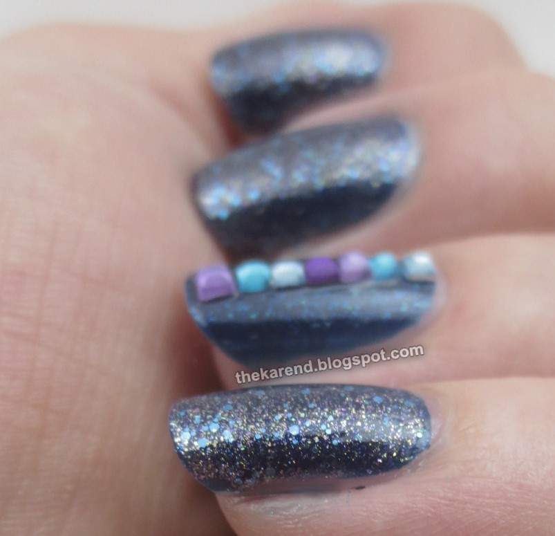
Includes some samples provided for review

Today I have the thing that consumed this week's blogging time that could otherwise have been devoted to Nail Wheel Wednesday: a big comparison post of jelly polishes. OPI, Essie, and Sephora have all released jellies this summer, and of course I wanted to try them and see how they matched up with my go to Wet Paint jellies as well as a few older releases. I actually swatched for this post twice, once before I'd seen the Essie shades, and once after I'd kindly been sent a set by a rep for a different brand just so I could make my post more complete. Thus you'll see some swatches from back when was trying to coax my nails to be more squoval and some more recent ones when I've once again I let them follow their natural oval tendencies. I really really intended to get this post out long before now, but as I've expressed probably too many times already, retiring has really messed with my routines.


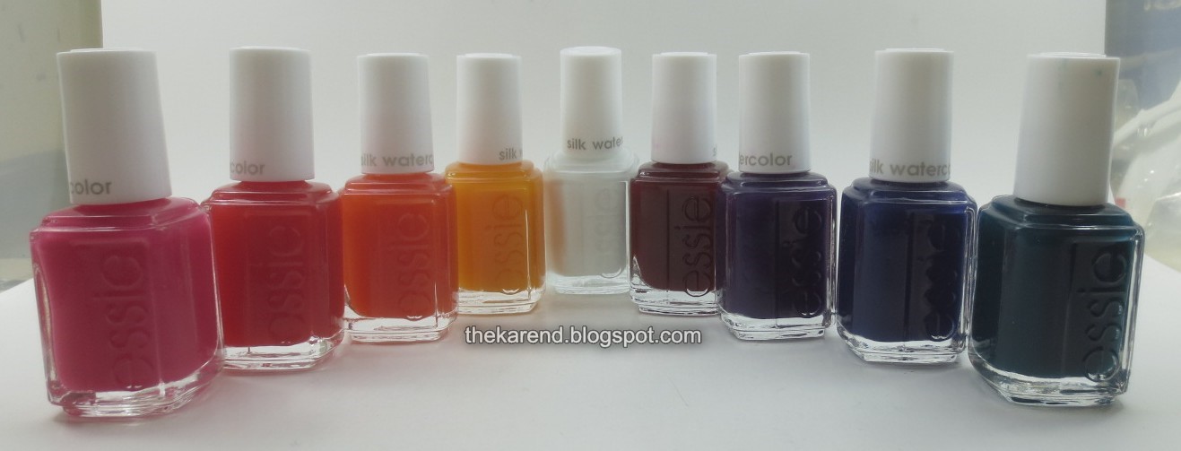
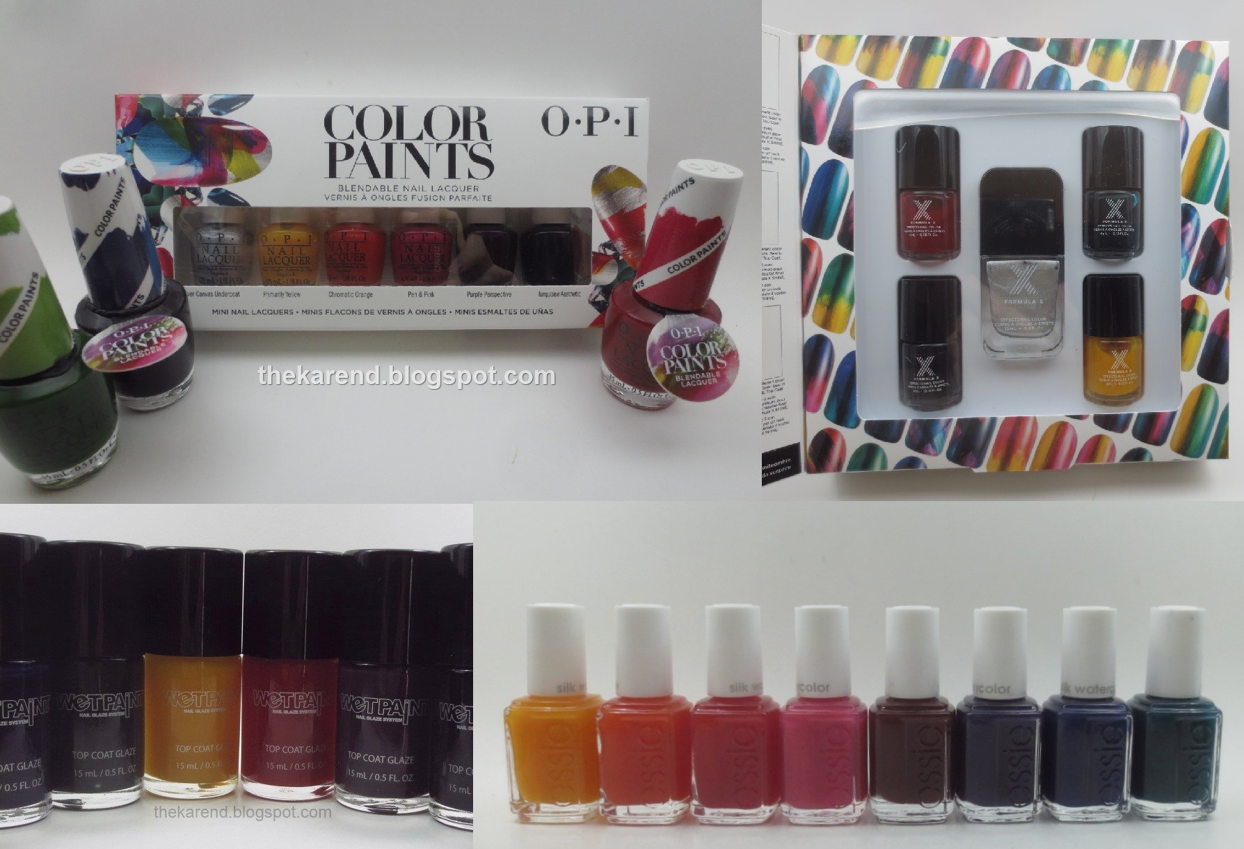
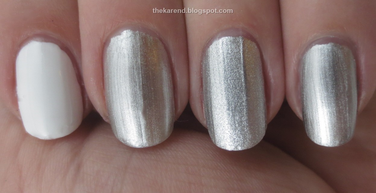
Let us start with bases, because I was not going to swatch these over bare nails, and the three newest sets of jellies all have a base sold with them. Left to right below: Essie White Page (from the Silk Watercolor collection), OPI Silver Canvas Undercoat (from Color Paints), Wet Paint Always Buy Platinum (core), Formula X Platinum Prime (from the Infinite Ombre set). The white was two coats; the silvers one coat each. The Wet Paint is the winner of the silver bases, as it doesn't look streaky but rather is subtly sparkly (what may look like a streak is in fact a prominent ridge on my nail; I didn't use base coat under these).


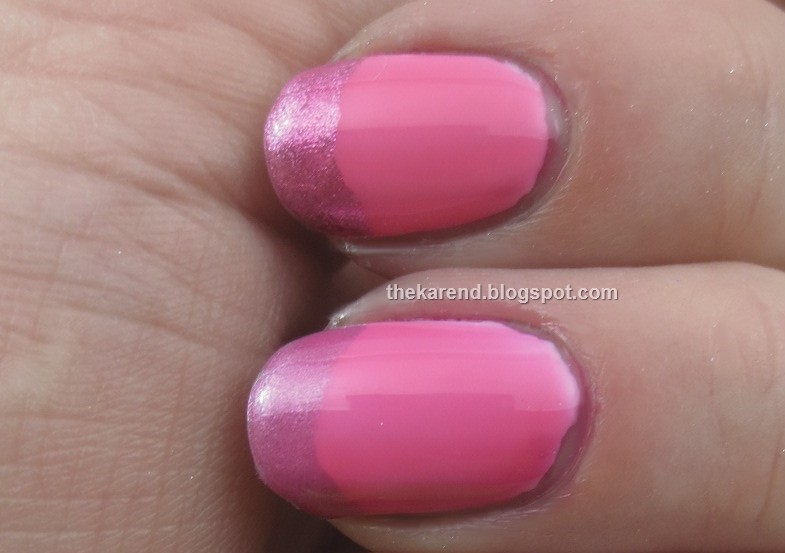
To show the effect of these bases, I topped them with the same jelly polish, Essie Blush Stroke. Note how over the white, the jelly is a warm pink, but the silvers make it look cool-toned.


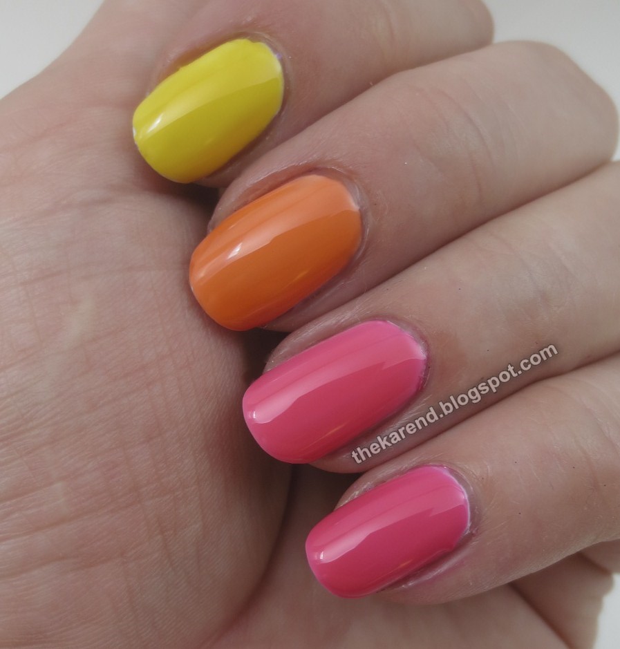
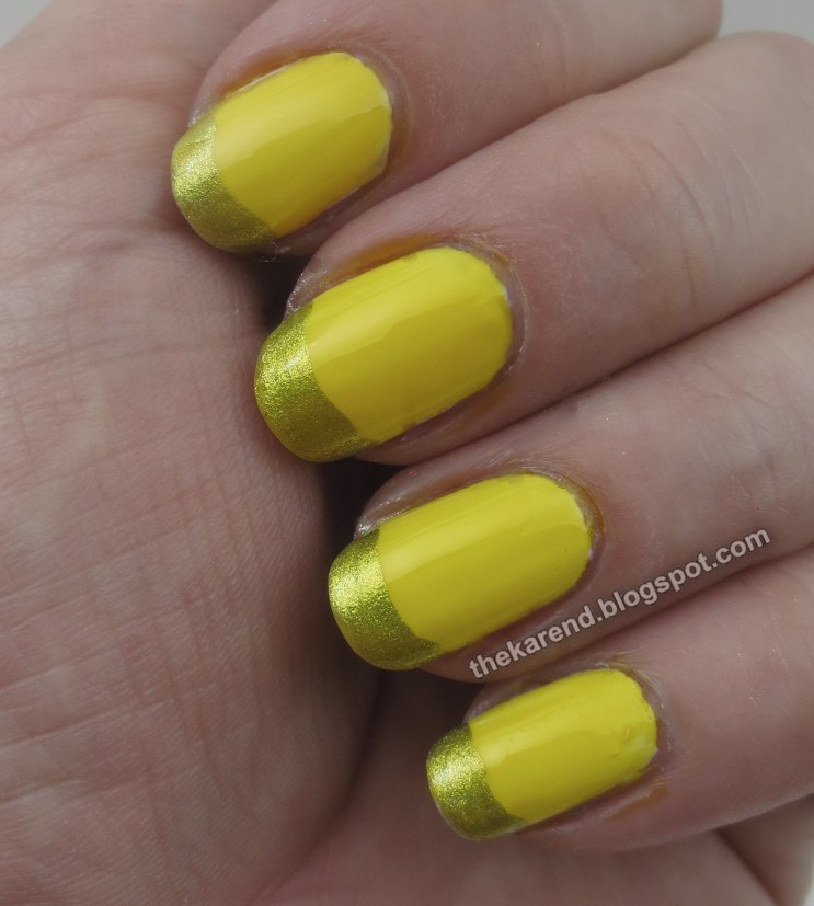
I decided to do a white base (Sally Hansen Insta Dri Whirlwind White) with silver tips (Nicole by OPI Give Me the 1st Dance) for many of the comparisons to show the jellies over both. I started with the yellows, as those seemed to have the least variation when I did quick test swatches on paper. Top to bottom: Essie Muse Myself, Formula X Limitless Lemon, Wet Paint Raincoat Slicker, OPI Primarily Yellow. I did two coats of each of the jellies over the funky French base. I can't really see any significant differences among these.


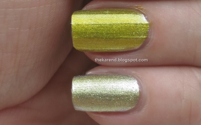
I did see a significant difference between this year's OPI yellow jelly (top in photo below) and the one from the Color Tints release, I'm Never Amberassed (bottom). These are both over one coat of Nicole by OPI Give Me the 1st Dance.


The oranges are up next. Top to bottom: Essie Art New-Beau, L'Oreal Mango Mamma, Wet Paint Orange Julia's, and OPI Chromatic Orange. All jellies were two coats except for the OPI, which was one. The L'Oreal is the most yellow-leaning of the quartet, followed by the Wet Paint, then Essie and OPI, which are both more of a true orange. I wouldn't say the Essie and OPI are dupes, though, since the OPI is more pigmented and one coat of it matches two of the Essie.


I can't do bottle pics for all of the comparisons or we'd be here all day, but I did want to include this one for the oranges because it shows why we gotta swatch. Looking at the bottles, I'd guess the Essie and L'Oreal were dupes, but no, they are not.


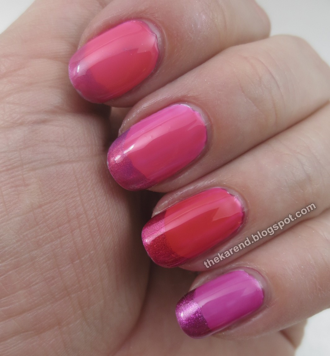
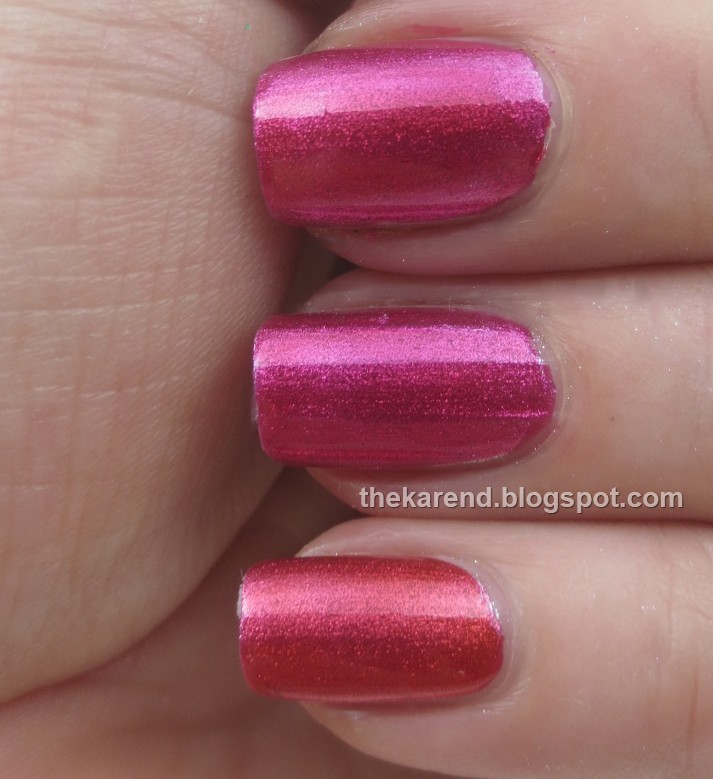
Moving on to pinks and reds, we have, top to bottom, Essie Blush Stroke, L'Oreal Jolly Lolly, Wet Paint Jelly Rancher Red, and Formula X Boundless Berry. The Essie was two coats, the others one. All of these look more red in the bottle than on the nail. The Wet Paint comes closest to red on the nail, more on the white base than silver.


Pink is so popular, there were enough to do a second hand of comparisons. Top to bottom: Essie Love Sheen, OPI Pen & Pink, OPI Magenta Muse, Essie Highest Bidder. Love Sheen was two coats, the others one. Highest Bidder looked berry in the bottle but is red violet on the nail.


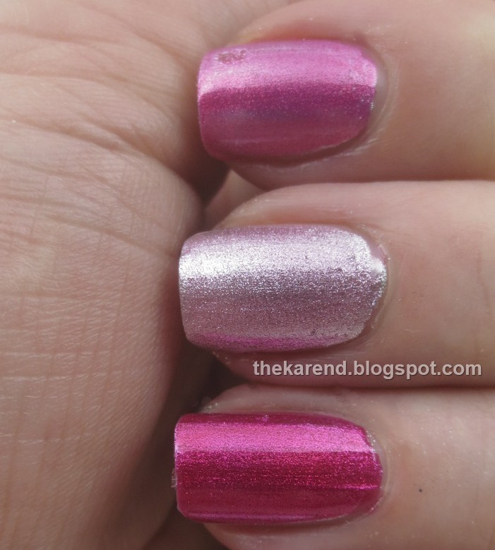
In the above shot, OPI Magenta Muse looks almost red compared to the others, but here's another look. Top to bottom: Formula X Boundless Berry, OPI Magenta Muse, and Wet Paint Jelly Rancher Red, all one coat over silver. The Formula X and OPI are pretty much dupes, both pinker than the Wet Paint.


I split the two Essie pinks into different comparisons as one looked much redder in the bottle, but on the nail, they're not that different. In the photo below, Blush Stroke is on top, Love Sheen on the bottom; at one coat as they are here, they're pretty similar.


While I'm on this hue, here's one more comparison, all OPIs. Top to bottom: Pen & Pink, Be Magentale With Me (Color Tints), and Magenta Muse. I used two coats of Be Magentale With Me to one of the other, but you can see it didn't really build up.


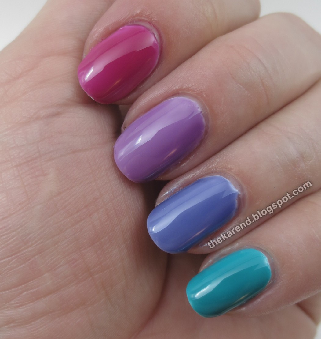
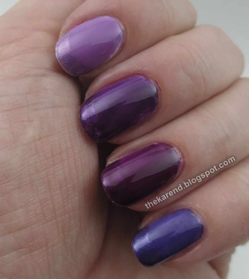
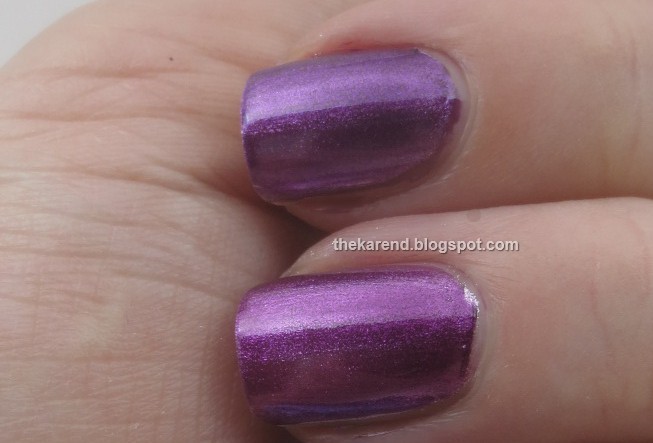
And now my favorite color, purple. Top to bottom: Essie No Shrinking Violet, OPI Purple Perspective, Wet Paint Jazzberry Jam, and Wet Paint Grape Minds Think Alike. I used two coats for all but Grape Minds.


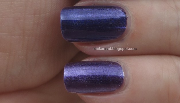
Another look at two of the purples: OPI Purple Perspective on top, Wet Paint Jazzberry Jam on the bottom, each one thin coat over silver. The difference between them is more subtle here, but you can still see that the OPI is cooler toned.


And here's a transitional purple to blue shot. Wet Paint Grape Minds Think Alike is a blue-toned purple and Formula X Infinite Indigo is a purple-toned blue; here they are side by side, Formula X on top.


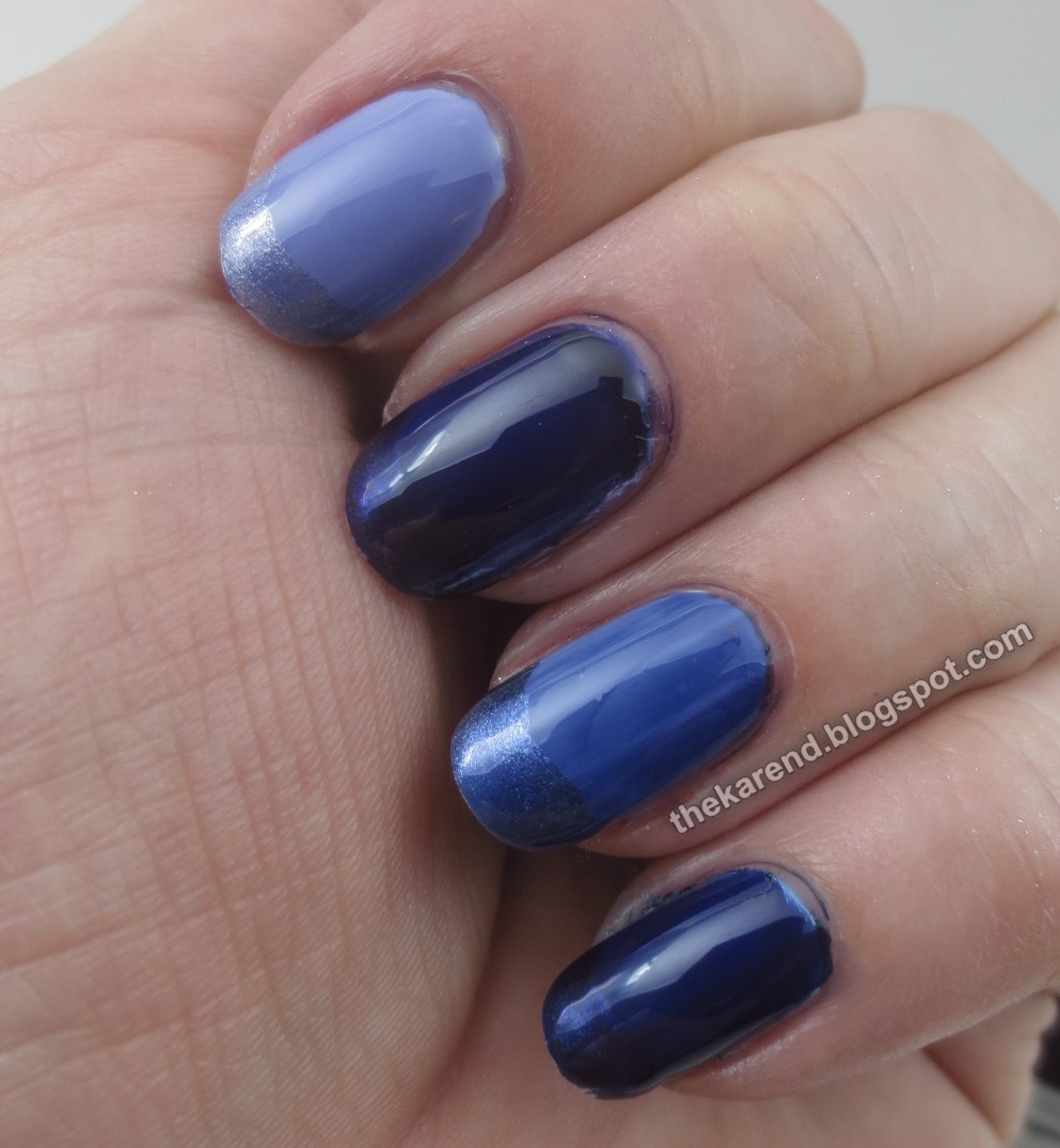
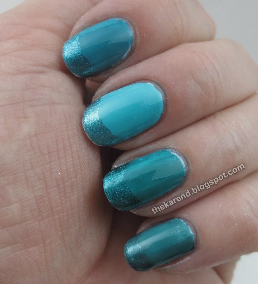
Moving on to the blues now. Top to bottom: Essie Point of Blue, Formula X Infinite Indigo, Wet Paint Inky Nights, OPI Indigo Motif. I used two coats of the Essie and Formula X, one coat of the others. The OPI seems oddly dark compared to the other colors in the collection.


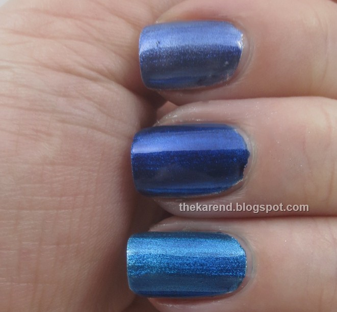
There is another blue jelly from Wet Paint I couldn't fit in the above comparison; it's in the shot below. Top to bottom: Wet Paint Inky Nights, OPI Indigo Motif, Wet Paint Waterfalling for You. All are one coat. The OPI still seems oddly opaque for a jelly.


After blue comes blue green, which had more entrants than I expected. Top to bottom, OPI Turquoise Aesthetic, Essie Pen & Inky, Formula X Timeless Teal, and Wet Paint I Am Aquagirl. All one coat except Aquagirl, where I used two. The OPI and Essie are more blue than green, the Formula X and Wet Paint more green than blue.


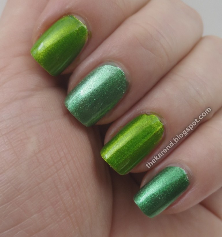
In all these jellies, there are only two greens, and one of them is really more of a yellow green. Top to bottom: OPI Landscape Artist, Wet Paint Go Fly a Malachite, OPI Landscape Artist, Wet Paint Go Fly a Malachite. Each one coat over silver.


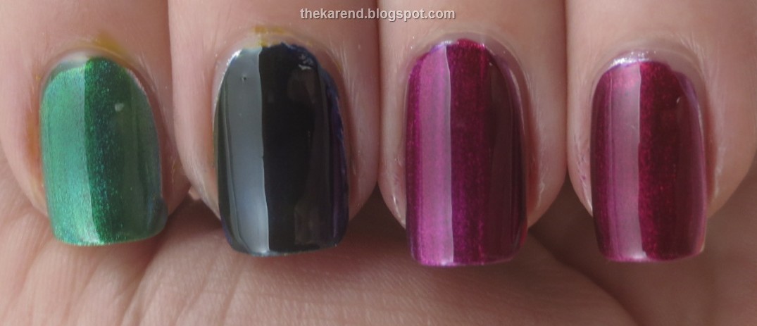
One of the fun things about jellies is layering, but not all jellies are alike in this regard. On the far left below, Wet Paint Waterfalling for You (blue) plus Wet Paint Raincoat Slicker (yellow) make green. Next to that, OPI Indigo Motif plus OPI Yellow Primarily yellow don't make green because the blue is too pigmented to layer well. Next to that, OPI Purple Perspective plus Magenta Muse do blend, as neither is so dark as the Indigo was. On the far right, Wet Paint Jazzberry Jam plus Jelly Rancher Red make a nice plummy color.


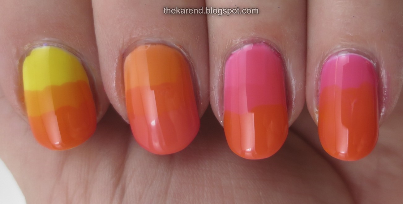
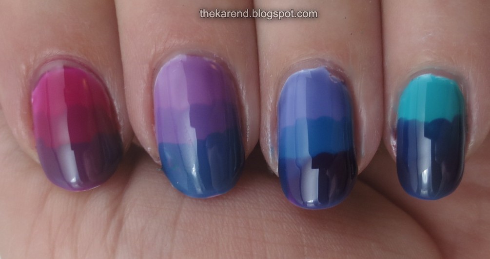
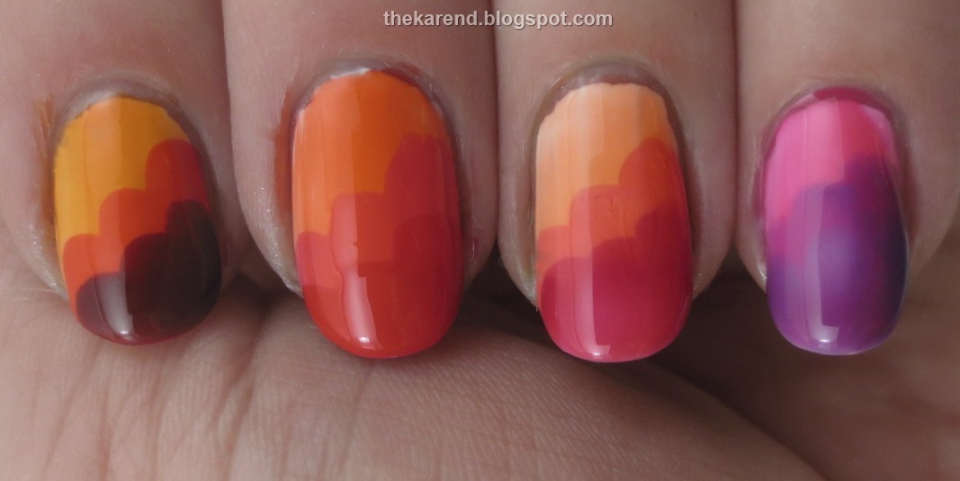
For a last bit of fun with these, I did clouds a la Nailside. Far left below: Wet Paint Orange Julia's, Jolly Rancher Red, and Jazzberry Jam. Next: OPI Chromatic Orange, Pen & Pink, Magenta Muse. Next: Essie Art New-Beau, Blush Stroke, and Highest Bidder. Far right (which I did not let dry long enough between layers): Essie Love Sheen, No Shrinking Violet, and Point of Blue.


Whew, that's a lot of comparisons. Overall, the Essie mostly are more sheer, while the OPI are somewhat inconsistent in pigmentation. I'm not sure what to say about the Formula X other than the set would be a good gift for someone who had no jellies. None of this summer's crop bumped Wet Paint out of their position as my favorites, and unlike the limited edition Essie and OPI, the Wet Paint are core. Sure, some colors do go out of stock from time to time, but as far as I know none are disappearing permanently the way the LEs from the other brands will.

The Wet Paint and Essie polishes shown in this entry were provided free for review purposes. The content of the entry was not dictated by the provider, and I get to keep the polishes for my own use.